Bad Designs: Video Rentals
[人因工程 ]
(2003/01/30)
Bad Designs: Video Rentals
A lot of video rental shops put their videos into these generic plastic boxes. This is to protect the video while it being rented out to people. I have problems putting the video back into the box correctly. The problem is that the videotape spools look like they are in the middle, but they are slightly closer to one edge than the other. And the box has little round protrusions that go into the spools.
The left picture shows the video oriented in the box wrong. That's what I frequently do. As a result, the box won't snap shut because the protrusions don't fit into the videotape spools. The right picture shows the tape in correctly.
Design Recommendations:
Why does the box need those protrusions anyway? If they were removed, the tape could fit into the box four different ways instead of just one. Of course, it would come out of the box four different ways too. That might be problem for the video shop people trying to read the labels on the videotapes.
Here are a few things that might make it easier for people to put the tape into the box the way the video people want it:
-- A line drawing of a videotape in the correct orientation "printed" on the inside of the box
-- A message like "Label this way" printed on the inside of the box
Editor's Comments:
One of my architecture professors at Rice University used to refer to this kind of design defect as "almost, but not quite". It was an apt formulation. The protrusions inside a standard plastic VHS videocassette box are "almost, but not quite" in the center. The problem of course originates with the design of the VHS cassette itself, but might have been remedied with some clever design of the outer case.
We have all at one time or another used cardboard, wood, plastic, or metal containers with rectangular lids. Occasionally these lids are "almost, but not quite" square. Lids that are obviously rectangular -- with a length to width ratio of 5 to 3 or more, are no problem. One can clearly see how they should be oriented in order to reseal their respective containers. It's the lids that are "almost, but not quite" square -- say 11 to 10, that artificially generate endless, unnecessary inconvenience.
I can hear some people groaning already. "Oh please, stop with the nitpicking. What's the big deal? Is anyone's life going to be endangered by this design defect?" Of course not. But if it wasn't such a big deal, if it was such a trivial matter, why wasn't it properly dealt with before it went into mass production? Before a defective layout on some draftsman's CAD screen was replicated in plastic a billion times over?
Here is where bad industrial design is worse than bad architectural design. A bad architectural design usually only gets built once, in a single location. If you don't have to live near the building, work in it, or visit it, you don't have to put up with its design defects. Bad product design on the other hand, gets reproduced billions of times and finds its way into our living rooms, by which time it's too late.
-- Bevin Chu
Explanation: Bad Designs: Video Rentals
Illustration: Video Rentals
Author: Michael J. Darnell
Affiliation: Bad Human Factors Designs
Source: www.baddesigns.com
Publication Date: 1998-1999
Original Language: English
Editor: Bevin Chu, Registered Architect
Thursday, January 30, 2003
Bad Designs: Stove Top Controls
[人因工程 ]
(2003/01/30)
Bad Designs: Stove Top Controls
This is the obligatory stove top control example that probably appears in every book on human factors design to illustrate bad design. The problem is that it is difficult to tell which control goes with which burner.
Here is a picture of a good stove top control design following a solution that has been known for years. The solution is to arrange the controls in the same configuration as the burners. It is quite easy to tell which burner goes with which control. Why do you think all stove tops layouts aren't designed like this one?
Design Recommendations:
One way to make it easy to tell which control goes with which device is to arrange the controls in the same layout as the devices.
Editor's Comments:
Natural mapping makes sense to one's intellect, but far more importantly, it makes sense to one's intuition and instincts. The following admission may elicit no small amusement from DPC readers, but even the chest of drawers in the editor's bedroom are "naturally mapped". Socks are consigned to the bottom drawer, briefs to the middle, and undershirts to the top. One could of course stuff socks in the top drawer and undershirts in the bottom drawer, but why?
-- Bevin Chu
Illustration: Stove Top Controls
Explanation: Bad Designs: Stove Top Controls
Author: Michael J. Darnell
Affiliation: Bad Human Factors Designs
Publication Date: 1998-1999
Source: www.baddesigns.com
Original Language: English
Editor: Bevin Chu, Registered Architect
[人因工程 ]
(2003/01/30)
Bad Designs: Stove Top Controls
This is the obligatory stove top control example that probably appears in every book on human factors design to illustrate bad design. The problem is that it is difficult to tell which control goes with which burner.
Here is a picture of a good stove top control design following a solution that has been known for years. The solution is to arrange the controls in the same configuration as the burners. It is quite easy to tell which burner goes with which control. Why do you think all stove tops layouts aren't designed like this one?
Design Recommendations:
One way to make it easy to tell which control goes with which device is to arrange the controls in the same layout as the devices.
Editor's Comments:
Natural mapping makes sense to one's intellect, but far more importantly, it makes sense to one's intuition and instincts. The following admission may elicit no small amusement from DPC readers, but even the chest of drawers in the editor's bedroom are "naturally mapped". Socks are consigned to the bottom drawer, briefs to the middle, and undershirts to the top. One could of course stuff socks in the top drawer and undershirts in the bottom drawer, but why?
-- Bevin Chu
Illustration: Stove Top Controls
Explanation: Bad Designs: Stove Top Controls
Author: Michael J. Darnell
Affiliation: Bad Human Factors Designs
Publication Date: 1998-1999
Source: www.baddesigns.com
Original Language: English
Editor: Bevin Chu, Registered Architect
Wednesday, January 29, 2003
Bad Designs: How Do You Open the Refrigerator?
[人因工程 ]
(2003/01/29)
Bad Designs: How do you open the refrigerator?
At my new job there is a refrigerator where employees put their lunches. The first time I tried to open the refrigerator I didn't see a handle on the front, but I found one on the left side of the door. (See arrow.) I pulled on the handle, but the door would not open. I thought maybe the refrigerator door had a really strong seal, so I pulled harder. I pulled so hard the whole refrigerator started moving! Someone standing nearby told me, "It opens from the other side. I had the same problem when I first tried to open it."
I looked on the right side of the refrigerator and sure enough, there was a handle there too! When I pulled on that handle, the refrigerator door opened easily.
Apparently, the refrigerator door was designed so it could be hinged on either the left or the right side. Thus, handles were put on both sides. However, people only expect to see one handle on a refrigerator door. When the handle doesn't work, they assume the door is stuck or locked.
Design Recommendations:
It would be best to put a handle on the front of a refrigerator door so that it can be easily seen. On a reversible door with handles on both sides of the door, there should be a way of removing or concealing the handle on the hinged side. There should not be visible handles on both sides!
Editor's Comments:
The refrigerator door cited by the author is another example of highly misleading "false symmetry" inflicting no end of inconvenience on end users. Yet one is inclined to cut the person responsible a little slack. Why? Because the false symmetry in this case was not the result of a styling whim. It was the unfortunate side effect of an earnest attempt to provide consumers with a door that could open in either direction while keeping manufacturing costs down. This does not alter the fact that it is still a bad design which inconveniences countless end users. But at least it saved the purchaser a little money. A better solution would have been a higher visibilty, easier to grab door handle that could be attached to either side of the door. The same cannot be said of the "streamlined" stapler featured in an earlier article, which probably cost more to manufacture, was probably tagged as a "deluxe model" and priced accordingly.
-- Bevin Chu
Explanation: Bad Designs: How Do You Open the Refrigerator?
Illustration: How Do You Open the Refrigerator?
Author: Michael J. Darnell
Affiliation: Bad Human Factors Designs
Source: www.baddesigns.com
Publication Date: 1998-1999
Original Language: English
Editor: Bevin Chu, Registered Architect
Bad Designs: Opening the File Drawer
[人因工程 ]
(2003/01/29)
Bad Designs: Opening the File Drawer
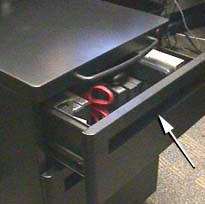
Recently, we got new file cabinets in our offices. The new file cabinets fit under our tables and are on wheels. During the first week that I used my file cabinet, when I tried to open the top file drawer, I found myself pulling the handle on the top (See arrow.) Guess what happened?
As shown in the photo on the left, the handle on the top doesn't open the top file drawer. Instead, it pulls the whole file cabinet out from under the table, which I accidently did quite often during that first week! When I visited other people's offices, I noticed that they were having the same problem.
The problem is that the handle to move the cabinet is very close to the top drawer and it is more obvious than the actual handle (See arrow) for the top drawer. Thus, it is easy to mistake the top handle as the handle for the top drawer. One is much more likely to want to open the file drawer than to move the cabinet, so the handle to move the cabinet should be less obvious.
Design Recommendations:
After about a week or two, I didn't make the mistake of trying to use the handle on the top to open the drawer. But if the handle on the top was not so obvious, I would never have had the problem in the first place. For example, if the handle on top had been recessed like the drawer handles as shown on the photo on the left, it wouldn't be as likely to be used accidently.
Editor's Comments:
The author of baddesigns.com is a highly qualified expert in Ergonomics and Human Factors Engineering, living and working in the United States, perhaps the most technologically advanced nation on earth. Yet even he must put up with a personal environment rife with obviously flawed design. This is highly ironic, and speaks volumes about the institutional inertia inherent within all societies. Many design problems are not amenable to purely technical solutions because the problem lies deeper, with public awareness. Ergonomics conscious design professionals can and must lead the way, but in the end a critical mass of the public must first become aware of the hidden cost flawed design exacts on them personally. They must become demanding consumers who simply will not accept defective designs. Only then will technical remedies truly take hold, and not before.
-- Bevin Chu
Explanation: Bad Designs: Opening the File Drawer
Illustration: Opening the File Drawer
Author: Michael J. Darnell
Affiliation: Bad Human Factors Designs
Source: www.baddesigns.com
Publication Date: 1998-1999
Original Language: English
Editor: Bevin Chu, Registered Architect
Tuesday, January 28, 2003
Bad Designs: Turn Down the TV
[人因工程 ]
(2003/01/28)
Bad Designs: Turn Down the TV
You are sitting in front of the TV, and want to turn down the sound. You grab the remote control, scan for the button with the down-arrow and push it. The TV gets louder! You pushed the up-arrow button instead of the down-arrow button. Why?
The letter "V" for volume is on the two volume control buttons. Although the buttons are shaped like up- and down-arrows for increasing and decreasing the volume, the letter "V" looks like a down-arrow. When you are scanning the remote control for a down-arrow, you see the "V" as a down-arrow, and press it. Unfortunately, the first "V" you see is on the up-arrow!
Design Recommendations:
Instead of the large "V" as a label on the volume control buttons, "Vol" in smaller letters could be used. In general, a control's features such as placement, shape, labeling, size, etc. need to work together to convey how to use the control. In this example, the shape and label convey conflicting information.
Editor's Comments:
The non-intuitive layout of the remote control mentioned above is unfortunately quite common. When the factory remote that came with one of the TV sets in my own household finally wore out after almost a decade of hard use, I searched for a replacement. Because the set was so old -- by today's standards, even the manufacturer's official repair station in Taipei was unable to supply me with a factory original duplicate. They sold me an aftermarket clone instead, which turned out to be electronically incompatible with my set and had to be returned. I had little choice but to go to Kuang Hua Computer Market in search of a replacement. Aftermarket replacements were plentiful, I discovered. One shop specializing in electronic accessories had about 30 different makes of aftermarket remotes on display. The problem was not quantity, but quality. None were going to win any awards for excellence in product design, and all exhibited at least one major human factors engineering defect. One cost NT$300, looked reasonably well made on the exterior, but its membrane keyboard stopped working after only 3 months. The out of production factory original cost NT$1000 and lasted 9 years. The aftermarket substitute cost NT$300, but lasted only 3 months. It was no bargain. If you were expecting a happy ending to this story, I'm sorry to have to disappoint you. Well designed, well made products in this category are nowhere to be found.
-- Bevin Chu
Explanation: Bad Designs: Turn Down the TV
Illustration: Turn Down the TV
Author: Michael J. Darnell
Affiliation: Bad Human Factors Designs
Source: www.baddesigns.com
Publication Date: 1998-1999
Original Language: English
Editor: Bevin Chu, Registered Architect
Bad Designs: Staplers
[人因工程 ]
(2003/01/28)
Staplers
Bad Designs: Staplers
One of these staplers is more difficult to use than the other. The nearer one is harder to line up from above because the handle blocks your view of where the staples come out. As a result, when you use the stapler you sometimes miss the paper.
Design recommendations:
From the side, the nearer stapler looks fine. You can easily see where the staples come out. But if you take the viewpoint of the user, directly above the stapler, you can't see where the staples come out. The lesson here is that when you design a device, take the view point of the user.
Editor's Comments:
The author is being kind to a fault. In fact the nearer stapler was not designed at all, it was styled. Design is not styling, and styling is not design. It could be worse. Much of today's "architectural design" is in fact mere styling. Many post-modern skyscraper "designs" in particular are nothing more than exercises in "styling the box". This is not always a bad thing, as the design parti of most skyscrapers are subject to tight constraints, and a little manipulation of the surfaces is really all there is left to do. Venerable landmarks such as the Chrysler Building in lower Manhattan are in fact Art Deco styling exercises, supremely well-executed. Styling is harmless provided it does not undermine function. The problem arises when styling, in a perverse variation of Gresham's Law, displaces design altogether. That is when we wind up with products such as the nearer stapler, and their architectural counterparts.
-- Bevin Chu
Explanation: Bad Designs: Staplers
Illustration: Staplers
Author: Michael J. Darnell
Affiliation: Bad Human Factors Designs
Source: www.baddesigns.com
Publication Date: 1998-1999
Original Language: English
Editor: Bevin Chu, Registered Architect
Monday, January 27, 2003
Bad Designs: Hard to Open
[人因工程 ]
(2003/01/27)
Bad Designs: Hard to Open
Here is a door to a gourmet coffee shop in a designer hotel in New York City. The door is made of solid glass and is very heavy. The top half of the door is clear glass. The bottom half is frosted glass. The handle is in the middle of the door. This makes it very difficult to pull the door open because you can't get any leverage.
Design recommendations:
Normal doors have handles placed on the side of the door. This gives the person opening the door superior leverage. Placing the handle in the middle of the door was most likely done because a designer thought it was aesthetically pleasing. Unfortunately, the design fails in usability.
Editor's Comments:
This "designer" door pull, mounted on the centerline of a heavy entrance door, is a flagrant violation of architectural design conventions. Door pulls are invariably mounted on the latch side of doors for good reasons. First, they provide users with the maximum possible leverage when opening the door. Second, they visually cue users from a distance which of two possible directions a door swings, allowing users to pre-position themselves to one side or the other, not only so their bodies may pass through the doorway more easily, but also so they may better apply the proper body English. A center-mounted door pull deprives users of both crucial mechanical leverage and helpful visual cues, merely to satisfy a frivolous quest for novelty.
Thinking outside the box" does not mean indiscriminately tossing out design conventions that have withstood the test of time. Design is not styling. Creativity is not whimsy. Innovation is not trendiness. Clothing designers may get away with foisting their unwearable styling exercises onto gullible fashion victims; their "creations" find their way into Salvation Army donation bins soon enough. But buildings and more durable industrial products hang around considerably longer, long enough for users to realize somebody screwed up, badly.
-- Bevin Chu
Explanation: Bad Designs: Hard to Open
Illustration: Hard to Open
Author: Michael J. Darnell
Affiliation: Bad Human Factors Designs
Source: www.baddesigns.com
Publication Date: 1998-1999
Original Language: English
Editor: Bevin Chu, Registered Architect
Wednesday, January 22, 2003
Bad Designs: The Path of Least Resistance
[人因工程 ]
(2003/01/22)
Bad Designs: The Path of Least Resistance
This photograph shows the view from the entrance for one building to the entrance for another. A lot of people walk between these two doors. Whoever designed this court yard designed the walkways so that they wrap around both sides of the court yard.
Notice the dirt path between the two doors? (See arrow.) People have created this path by stepping over the wall and walking across what used to be grass. This spontaneously created path shows where the walkway should have been in the first place.
Design Recommendation:
Many people will take the path of least resistance. Figure out where people are going to walk before putting in a walkway.
Editor's Comments:
The editor had the good fortune to attend architecture school at one of the finest schools of design in the United States -- William Marsh Rice University in Houston, Texas. During Freshman Week one of our professors shared a fascinating bit of trivia with the entering class of "archies" i.e., architecture majors. He told us how the unusually convenient pink pebble aggregate sidewalks diagonally criss-crossing the lush green campus came into being. The original campus architects, it seems, purposely delayed completing the sidewalks. Instead they waited until the students and faculty had a chance to use the buildings for several months. They then walked the grounds with a set of site plans noting where the grass had been worn smooth by pedestrian traffic, then specified that was where the final sidewalks were to be laid out. Design professionals talk about "iterative design", generally to little effect. The editor was lucky enough to encounter a genuine instance of iterative design early in his architectural career. Sad to say he would encounter very few additional examples in the years to come.
-- Bevin Chu
Explanation: Bad Designs: The Path of Least Resistance
Illustration: The Path of Least Resistance
Author: Michael J. Darnell
Affiliation: Bad Human Factors Designs
Source: www.baddesigns.com
Publication Date: 1998-1999
Original Language: English
Editor: Bevin Chu, Registered Architect
Tuesday, January 21, 2003
Bad Designs: Which Way Does the Door Open?
[人因工程 ]
(2003/01/21)
Bad Designs: Which Way Does the Door Open?
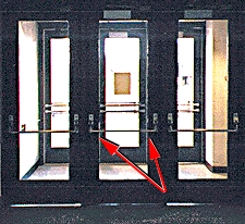
Can you guess which end of the bar to push in order to open the center door? The door provides no obvious visual clue. If you push on the wrong end of the bar -- the end closer to the door hinge -- it is very difficult to open the door, it takes a great deal of force.
Design Recommendation:
One solution to this problem would be to add an easy-to-push surface to the bar on the end closer to the latch. This surface could merely be a thickening of the bar or it could be a flat plate, but it should look like something that would be easier to push than the bar itself. This would "invite" people to push on the correct end of the bar.
Editor's Comments:
This example constitutes further evidence, as if it were needed, that false symmetry equals bad design. Doors are not bilaterally symmetrical. They have hinge sides and latch sides. The hinge side remains in place while the latch side travels in an arc. Yet the push bar fails to reflect the reality of the door's inherent asymmetry, to the detriment of end users. Why? Two possibilities come to mind. One, manufacturing expedience. It is easier from a manufacturing perspective to fabricate a simple push bar that is uniform in cross section along its entire length. Two, and this is worse, the designer labors under the misguided belief that symmetrical shapes are "better looking" even when they flagrantly misrepresent how a device actually works. Here the primary responsibility lies with the product designer who "designed" the push bar, while the secondary responsibility lies with the architect who specified the door hardware for the project in question. Again, a case of failing to visualize the impact ones' design decisions have on hapless end users in the real world.
-- Bevin Chu
Explanation: Bad Designs: Which Way Does the Door Open?
Illustration: Which Way Does the Door Open?
Author: Michael J. Darnell
Affiliation: Bad Human Factors Designs
Source: www.baddesigns.com
Publication Date: 1998-1999
Original Language: English
Editor: Bevin Chu, Registered Architect
Bad Designs: Trapped Between the Doors!
[人因工程 ]
(2003/01/21)
Bad Designs: Trapped Between the Doors!
This picture shows a short walkway connecting two buildings, with a set of doors at each end of the walkway. A friend told me a funny story about the first time she used this walkway.
She and a co-worker walked from one building to the other. They pulled the handles that opened the doors and proceeded down the walkway. Upon reaching the other end they again pulled the handles, but the doors wouldn't budge. Assuming the doors were locked, they returned to the doors from which they originally entered. But when they tried to open these doors, they wouldn't budge either. They were trapped in the walkway between the two buildings!
My friend and her co-worker spent the next few minutes trying to signal to people though the windows in the buildings, but the people they signaled seemed strangely reluctant to come to their rescue. Finally, after trying the doors again, they discovered they had to push the doors rather than pull them.
These doors have two problems. The first problem is the handles are designed for pulling rather than pushing. Doors designed for pushing usually have handles with flat surfaces that look easy to push and hard to pull. The second problem is the two sets of doors work in opposite ways. To pass through the walkway you must first pull open one set of doors and then push open the second set of doors.
My friend has observed many other people getting "trapped" in this walkway. While it makes for a funny story, imagine if people unfamiliar with these doors had to cross from one building to the other in an emergency, like a fire. Then it could turn from a comedy to a tragedy.
Design Recommendations:
One way to solve this problem would be to install doors that swing both ways, that can be opened by either pushing or pulling.
Another solution would be to install appropriate door handles. Flat push-bar handles would be installed on the sides of the doors to be pushed; the pull-type handles like those shown here would be installed on the sides of the doors to be pulled.
Finally, push and pull labels could be added to the doors, but this would not be an ideal solution. Labels only work for people who read the language. They only work under adequate lighting conditions. In practice, many people do not read such labels.
Editor's Comments:
The above is a textbook case of bad design. Some mechanically sophisticated individuals may be inclined to dismiss the victims as "dummies" and to absolve the architectural designer of responsibility, but as a professional architect I must disagree. Perhaps motivated by a misguided notion of what constitutes "simplicity", the designer imposed a highly misleading false symmetry on an asymmetrical reality. By doing so he set users up for their ordeal.
An ordinary walkway connecting two buildings is not supposed to be a gauntlet for testing the public's mechanical aptitude. Even if the user is mechanically adept and merely delayed by the amount of time it takes to pull on the handle, realize with irritation that it probably swings in the opposite direction, then push it open, the designer has already inconvenienced someone he was supposed to assist. Multiply this by the number of individuals forced to undergo the same inconvenience over the life of the building, and one can begin to appreciate the magnitude of the designer's blunder. Far from reflecting badly on the IQ of the end user, such problems reflect badly on the professionalism of their creators -- architects and industrial designers.
If a designer is enamored with symmetrical looking doors, he should insist on symmetrically functioning doors, i.e., doors that swing in both directions. Doors which swing in both directions may feature door pulls on both sides, push plates in both sides, or push bars on both sides. A door which swings in both directions can in fact be pulled open or pushed open from either side. Any such doors would telegraph from a distance how they operate, making them ergonomic and user-friendly.
Otherwise he should call for doors with door pulls on the pull side, and push plates or push bars on the push side. Such an honestly asymmetrical solution would bring form back in congruence with function, and would clearly communicate to any approaching user whether a door should be pushed or pulled, especially if the door is transparent and its asymmetry visible through the glass.
Specifying the same door pulls on both sides of doors that swing in only one direction is not "clean design", but bad design. If the designer's decision was intentional, then it was philosophically dishonest. If it was unintentional, it can be chalked up to naivete or negligence. Either way, the end user suffers, needlessly.
-- Bevin Chu
Explanation: Bad Designs: Trapped Between the Doors
Illustration: Trapped Between the Doors!
Author: Michael J. Darnell
Affiliation: Bad Human Factors Designs
Source: www.baddesigns.com
Publication Date: 1998-1999
Original Language: English
Editor: Bevin Chu, Registered Architect
Nonergonomic! Light Switches are not Rocket Science
[人因工程 ]
(2003/01/21)
Light Switches are not Rocket Science
Editor's Comments:
This animated gif illustrates an extremely inconvenient, highly confusing, anti-intuitive arrangement of wall mounted light switches that unfortunately is all too common in our homes and offices.
Actually the animated gif does not illustrate the worst scenario imagineable. Far from it. The editor is keenly aware of this for a very good reason. The "electrician" who wired a pair of hallway light switches in his parents' condominium outdid this negative example. He committed the very same error illustrated in this animated gif by wiring the two switches in the wrong position left to right. But he did not stop there. He compounded his error by wiring one of the two switches upside down. Not only are the two switches in the wrong position left to right, one of the switches must be flicked down to turn the light on.
It may not be immediately apparent, but believe me when I tell you this is the worst arrangement possible. Having only one switch wired upside down is even worse than having both switches wired upside down. If both switches are wired upside down, one can simply make a mental note: "These two switches are screwed up. Just remember to flick both switches down in order to turn the lights on and you'll be okay."
But with only one of the switches wired upside down, one can never remember which switch needs to be flicked down and which needs to be flicked up! Don't forget, this is in addition to the two switches being mounted in the wrong positions laterally.
Mankind recently entered the Third Millennium. Why do idiotic mistakes like this still haunt us? After all, wiring a pair of wall switches correctly is not rocket science, and a mind is a terrible thing to waste.
-- Bevin Chu
Explanation: Light Switches are not Rocket Science Illustration: Animated Bad Design
Author: Michael J. Darnell
Affiliation: Bad Human Factors Designs
Source: www.baddesigns.com
Publication Date: 1998-1999
Original Language: English
Editor: Bevin Chu, Registered Architect
Subscribe to:
Posts (Atom)